Bay Area Metro
Speculative Brand Design
What if the Bay Area had a unified transit system?
This was the question proposed by Seamless Bay Area, a transit advocacy nonprofit in the Bay Area. For this project I created conceptual storyboards illustrating what a unified transit system could look and feel like, including designs for a unified brand identity, wayfinding and vehicle livery.
Client:
Seamless Bay Area
Year:
2021
Articulating the brand system
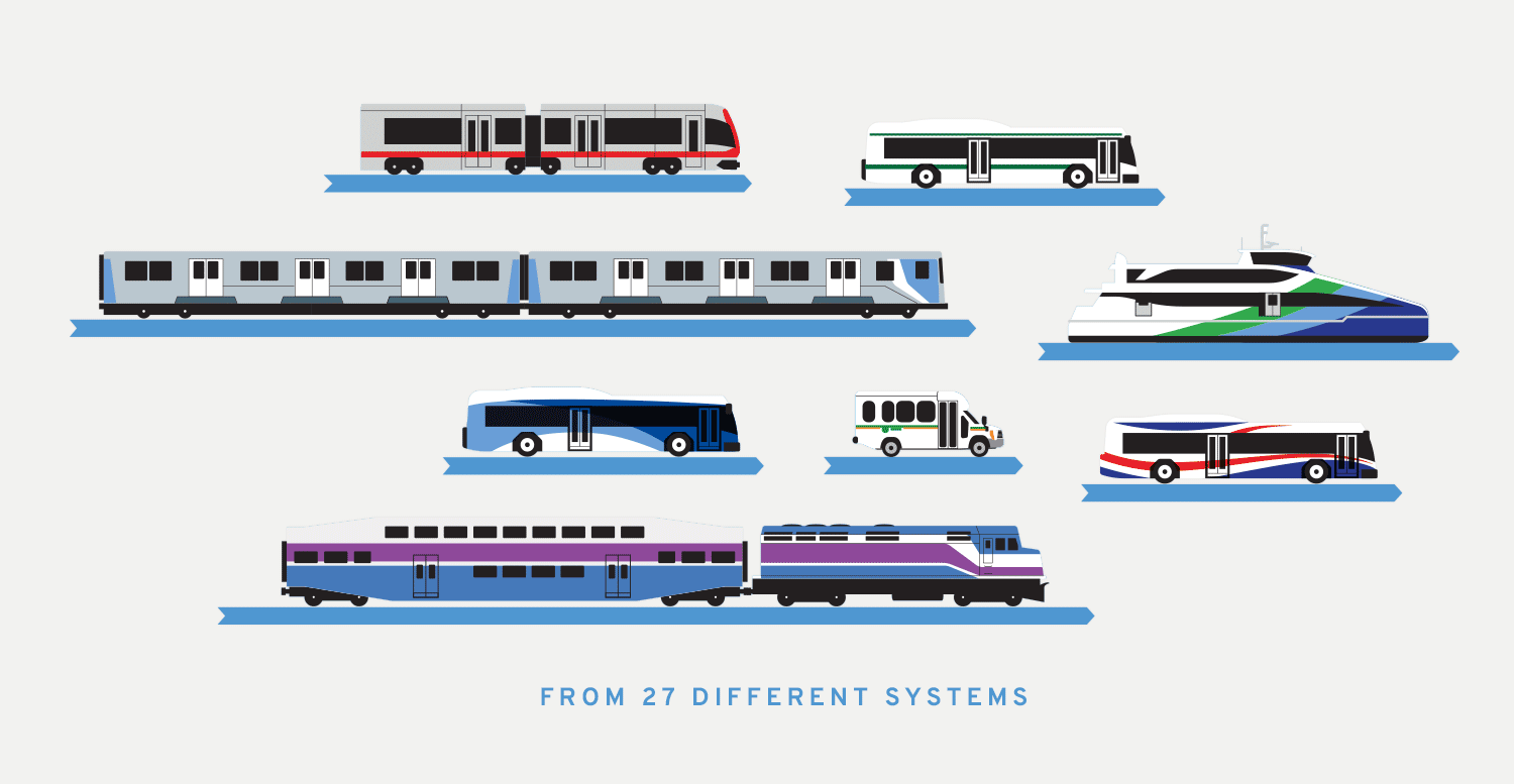
There are currently 27 transit brands in Bay Area. Our first discussion was about the broader brand system - how much should the design reference the old brands? In the name of a seamless rider experience, we decided a complete rebrand would be best; bringing all the agencies under a single umbrella - Bay Area Metro.
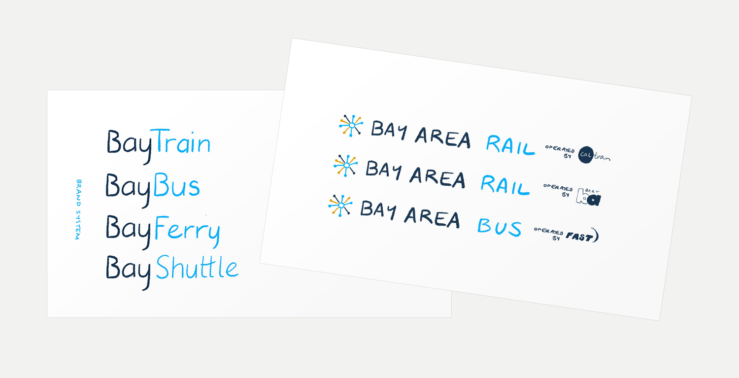
Logo sketches & concept art
From here I began a series of sketches - exploring how to make the 'M' for 'Metro' blend with the Bay Area's unique geography and points of interest to create a locally resonant, iconic brand mark.
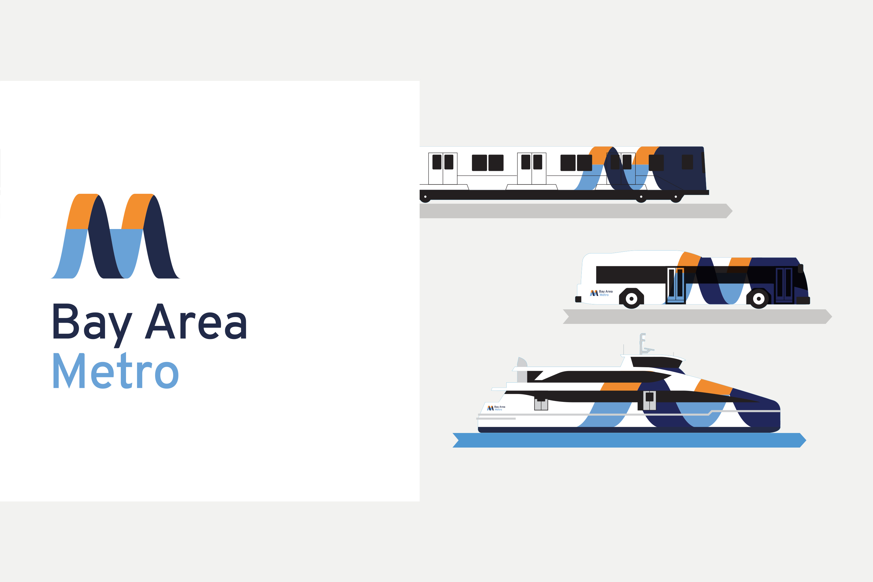
Final logo design
A clean, geometric ‘M’ for ‘Metro’ represents a cross-section of the Bay Area’s landscape - from left to right traversing ocean, mountain, bay, and mountain.
Vehicle Livery
How the logo would perform as vehicle livery was a key consideration for me. With so many vehicles in operation, I enjoyed finding a systematic way to apply the branding for maximum impact.
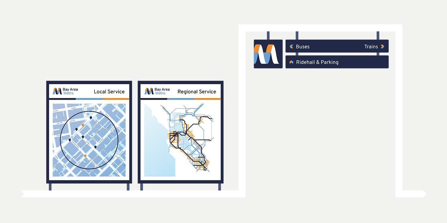
Wayfinding
I also created some simple concepts to show the brand as applied to wayfinding signage.
More about the project and the team
With input and feedback from Seamless Bay Area colleagues, I was the designer and illustrator on this project.
To find ways to support the vision for a unified transit system in the Bay Area, visit seamlessbayarea.org.